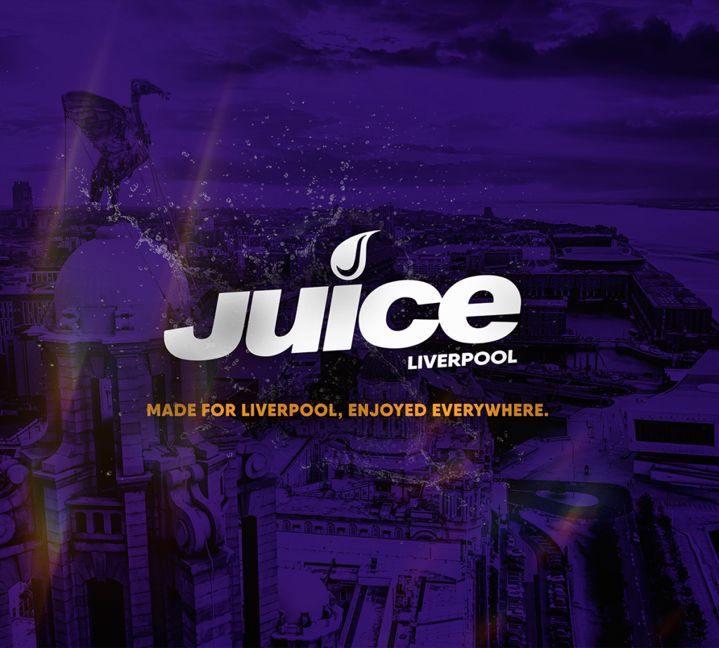
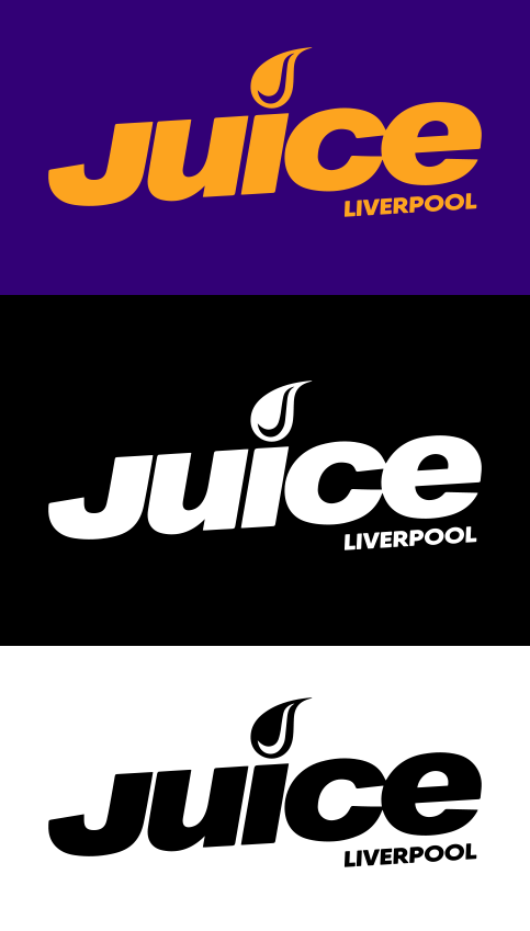
A vibrant identity update for Juice Liverpool, blending local pride with sonic energy. The refreshed logo introduces a stylized ‘J’ droplet icon, merging fluidity, sound waves, and the station’s name into a single, ownable mark. Liverpool elements are subtly embedded to root the brand in its cultural context, while the overall aesthetic leans fresh, dynamic, and unmistakably modern.